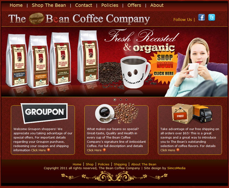
We love coffee and we love doing sites about coffee. So, needless to say, it was a blast doing a quick makeover of The Bean Coffee Company’s website! The original site design was based upon their printed materials and coffee bag color schemes. After a couple of years it was apparent we needed to add a little bit of excitement to the overall look.
The objective of the redesign was to simplify the content to emphasize the coffee. The original site had loads of text content intended to inform the visitors of various aspects of the company and their services. It became evident that most visitors were most interested in getting to the shopping! Therefore, the new design eliminated the unnecessary information, provides a more visually enhanced view of the products and gets the visitors into the store as quickly as possible while still outlining some of the information and specials that would be of interest to the consumer.
Features:
- converted layout format from a table based system to strictly XHTML/CSS
- added the Nivo Slider to the home page to provide a visual representation of the points of interest the company would like to relay to the visitor
- rearranged the pages to only provide information about services and offers
- simplified the menu system
Screenshots:
Below are some screenshots of the 3 slider images featured on the home page and the layout of the support pages.
[nggallery id=10]

0 Comments